PX to REM Converter

PX to REM Converter - Pixel to REM Conversion for Precise Sizing in Web Development Workflow

PX to REM Converter

PX to REM Converter -Introduction

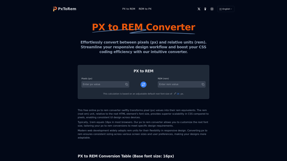
PX to REM Converter is a user-friendly online tool designed to simplify the process of converting pixel (px) values to rem (root em) units, which are essential for creating scalable and responsive web designs. By using this converter, web developers and designers can ensure consistent sizing across various devices and screen resolutions, enhancing the adaptability of their designs. The tool is particularly useful in modern web development, where rem units are favored for their flexibility in responsive design. With the ability to customize the root font size, users can tailor their conversions to meet specific design needs, making it an indispensable resource for anyone looking to streamline their CSS coding workflow. Whether you're a seasoned developer or a beginner, the PX to REM Converter offers a straightforward solution to enhance your design efficiency and maintain consistency across different platforms.

PX to REM Converter -Features

Product Features of PX to REM Converter

Overview

The PX to REM Converter is a free online tool designed to simplify the conversion of pixel (px) values to rem (root em) units, which are relative to the root HTML element's font size. This tool is essential for web developers aiming to enhance their responsive design workflow and improve CSS coding efficiency.

Main Purpose and Target User Group

The primary purpose of the PX to REM Converter is to facilitate precise sizing in web development by converting fixed pixel measurements into scalable rem units. It is particularly beneficial for web developers, designers, and anyone involved in creating responsive and adaptable web interfaces.

Function Details and Operations

  • Conversion Process: The tool automates the conversion of px to rem by dividing the pixel value by the root font size, typically set at 16px by default. Users can adjust the base font size for custom conversions.

  • Dual Conversion: It supports both PX to REM and REM to PX conversions, providing flexibility in design adjustments.

  • Conversion Table: Offers a quick reference table for common px to rem conversions based on a default 16px root font size.

  • Decimal Handling: Capable of processing decimal values for precise conversions.

User Benefits

  • Efficiency: Streamlines the conversion process, saving time and reducing manual calculation errors.

  • Scalability: Enhances design scalability across different devices and screen sizes.

  • Flexibility: Allows customization of the root font size to meet specific design requirements.

  • Free Access: Completely free to use, with unlimited conversions available.

Compatibility and Integration

The PX to REM Converter is compatible with all modern web browsers and can be easily integrated into any web development workflow. It supports multiple languages, making it accessible to a global audience.

Customer Feedback and Case Studies

Users have praised the PX to REM Converter for its accuracy and ease of use, noting significant improvements in their responsive design processes. Case studies highlight its role in achieving consistent UI design across various platforms and devices.

Access and Activation Method

The PX to REM Converter is accessible online at pxtorem.net. Users can start converting immediately without the need for registration or installation, ensuring a hassle-free experience.
PX to REM Converter -Frequently Asked Questions

Frequently Asked Questions

What is PX in web design and how does it relate to REM?

PX (pixel) is a fixed unit of measurement in digital design, representing the smallest controllable element on a screen. REM, on the other hand, is a relative unit that scales with the root font size, making it ideal for responsive design.

What is REM in CSS and how does it relate to PX?

REM stands for 'Root EM' and is a relative unit of measurement in CSS. It is used for converting px to rem, based on the root element's font size, typically the <html> element. In px to rem conversion, 1rem equals the font size of the root element, often set to 16px by default, allowing for scalable and responsive designs.

How does the PX to REM converter work?

Our PX to REM converter automates the conversion of pixel values to rem units by dividing the pixel value by the root font size (default 16px). For example, 16px = 1rem, 32px = 2rem, etc. You can also adjust the base font size for custom conversions.

Why use REM instead of PX in responsive web design?

REM is preferred for responsive design as it scales with the root font size, ensuring consistent proportions across different screen sizes and user font size preferences. This flexibility makes REM advantageous over PX in modern web development.

What's the default root font size for PX to REM conversion?

The default root font size in most browsers is 16px, meaning 1rem typically equals 16px unless explicitly changed. Our PX to REM converter allows you to adjust this base size for custom conversions.

Can I use the PX to REM converter for responsive design?

Absolutely! The PX to REM converter is an excellent tool for responsive design. Converting PX to REM helps maintain consistent proportions across different screen sizes and user font size preferences, crucial for creating flexible, responsive layouts.

Is this PX to REM converter free to use?

Yes, our PX to REM converter is completely free to use. You can perform as many PX to REM or REM to PX conversions as you need without any cost.

How accurate are the PX to REM conversions?

Our PX to REM converter provides highly accurate results, typically showing up to four decimal places for precise conversions. This level of accuracy ensures your designs will be pixel-perfect across different devices and screen sizes.

Can I copy the converted PX or REM values directly?

Yes, you can easily copy the converted PX or REM values by clicking the copy button next to each input field, making it convenient to use the results directly in your CSS code.

How can I use REM units effectively in my CSS?

To use REM units effectively, set a base font size on your root element (usually the <html> tag) and then use REM for font sizes, margins, paddings, and other properties throughout your CSS. This approach creates a scalable and maintainable design system.

Can the PX to REM converter handle decimal values?

Yes, our PX to REM converter can handle decimal values for both PX and REM inputs. This allows for precise conversions, even when dealing with fractional pixel or REM values in your designs.

PX to REM Converter -Data Analysis

Latest Traffic Information

  • Monthly Visits

    269

  • Bounce Rate

    43.04%

  • Pages Per Visit

    1.01

  • Visit Duration

    00:00:00

  • Global Rank

    28303501

  • Country Rank

    348456

Visits Over Time

Traffic Sources

  • direct:
    30.75%
  • referrals:
    12.28%
  • social:
    4.14%
  • mail:
    0.46%
  • search:
    50.34%
  • paidReferrals:
    0.78%
More data

PX to REM Converter - Alternative

Seline

Seline - Privacy-Friendly Website Analytics Platform with Flexible Pricing Plans

10.5 K
Tarot AI

Tarot AI - Free Accurate AI Tarot Reading, Personalized Insights & Online Predictions

349.2 K
Flux1 AI Generator

Flux1 AI Generator - AI Content Creation and Automated Writing Tool for Intelligent Text Generation and Creative AI Solutions

--
Asphaltcal Culator

Asphaltcal Culator - Accurate Asphalt Calculator Tool for Volume & Cost Estimation

--
More Tags about: PX to REM Converter